以下のようなボタンを作成します。
- 四角の中がボタンが押せる範囲
- rippleは円形の中だけ
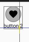
実装
clickable と indication を使用します。
interactionSource を共有し、rippleを表示させたくない範囲は indication を null にします。
@Preview
@Composable
public fun Preview() {
    val interactionSource = remember { MutableInteractionSource() }
    var count by remember { mutableStateOf(0) }
    Column(
        modifier = Modifier
            .padding(12.dp)
            .border(1.dp, color = Color.Gray, shape = RectangleShape)
            .clickable(
                indication = null,
                interactionSource = interactionSource,
            ) {
                count++
            },
        horizontalAlignment = Alignment.CenterHorizontally,
    ) {
        Icon(
            modifier = Modifier
                .size(42.dp)
                .clip(CircleShape)
                .border(
                    width = 1.dp,
                    color = Color.Gray,
                    shape = CircleShape
                )
                .indication(
                    indication = LocalIndication.current,
                    interactionSource = interactionSource,
                )
                .padding(8.dp),
            imageVector = Icons.Default.Favorite,
            contentDescription = null,
        )
        Text(text = "button $count")
    }
}
更新
2023/10/25
内側のindicationをclickableで実装する例を載せていましたが、これだとTalkBack等で二箇所クリック可能範囲としてフォーカスされてしまう為、不適切でした。